User Interface Layout
The VektorCAD editor is designed for efficient drafting across all devices — desktop, iPad, tablet, and mobile. The interface is divided into clearly defined regions so you can focus on your drawing while keeping all tools within reach.
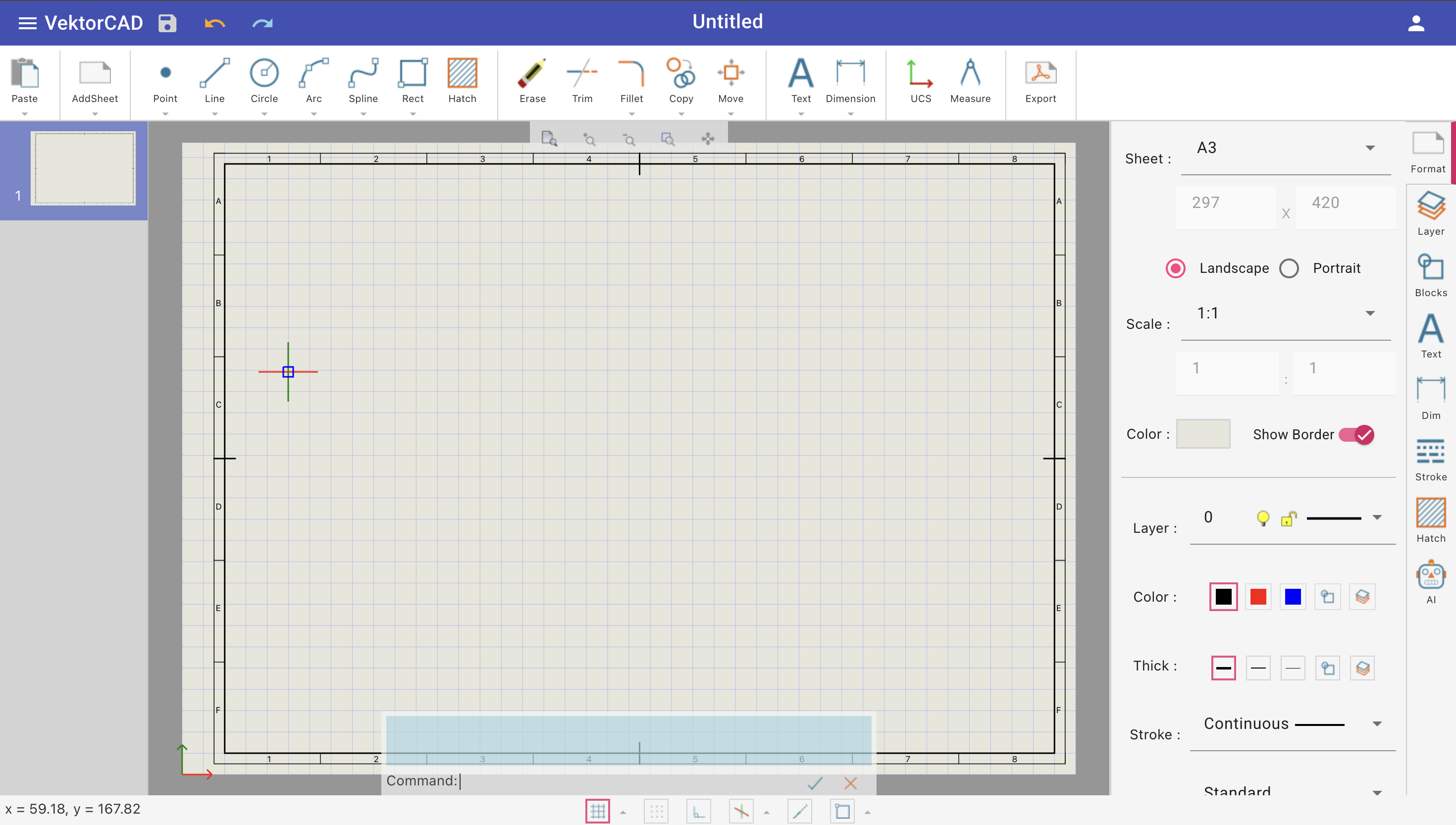
Overview
The interface is organized from top to bottom: Title Bar, Toolbar, Sheets Panel (left), Drawing Sheet (center), Symbols Panel (right), View Bar, Command Panel, and Status Bar.
Title Bar
The title bar is a dark bar across the top of the editor.
Left side:
| Element | Description |
|---|---|
| VektorCAD Logo | Click to return to the dashboard / file manager |
| Save | Save the current drawing to the cloud. The icon turns blue when there are unsaved changes |
| Undo | Revert the most recent action |
| Redo | Reapply the last undone action |
Center:
| Element | Description |
|---|---|
| File Name | Displays the active drawing name. Click to rename it inline |
Right side:
| Element | Description |
|---|---|
| Username | Displays the logged-in user |
| User Menu | Access Manage VektorCAD Account and Logout options, along with profile photo and email |
Staff view
When viewing a student submission (assignment or exam), the title bar also shows Submissions, Prev, and Next buttons for navigating between student files.
Toolbar
The toolbar is a horizontal strip below the title bar. It organizes all drawing and editing commands into logical groups separated by dividers.
| Section | Purpose |
|---|---|
| Clipboard | Paste, Cut, Copy entities to/from the clipboard |
| Sheet | Add, duplicate, or delete drawing sheets |
| Draw | Create geometry — Point, Line, Polyline, Circle, Arc, Spline, Rectangle, Polygon, Hatch, and more |
| Edit | Modify entities — Erase, Trim, Extend, Fillet, Chamfer, Copy, Move (with Rotate, Scale, Turn, Mirror, Array, Offset variants) |
| Annotation | Add Text, Multiline Text, Edit Text, Leader, and Dimensions (Linear, Aligned, Angular, Diametric, Radial, Big Radial, Oblique) |
| Tools | UCS and Measure utilities |
| Export | Export to PDF, DXF, JPEG, or SVG |
| Version & Help | View version history or open documentation |
Many buttons have a drop-down arrow revealing additional variations (e.g. the Line button includes Polyline, Parallel, Perpendicular, Angle, Bisector, Tangent, XLine, Ray, and more).
Tip
Hover over any toolbar button to see a detailed tooltip. You can also type any command name directly into the command panel.
When the browser window is narrow, overflow items collapse into a ⋮ menu on the right.
Sheets Panel
The sheets panel is a collapsible drawer on the left side of the editor. Toggle it with the ◀ / ▶ button.
Each sheet displays a thumbnail preview with its index number. Click a sheet to switch to it.
Right-click a sheet thumbnail to access the context menu:
| Action | Description |
|---|---|
| Add Sheet | Create a new blank sheet |
| Delete Sheet | Remove the selected sheet |
| Duplicate | Copy the sheet with all its entities |
| Move Up | Reorder the sheet one position up |
| Move Down | Reorder the sheet one position down |
Learn more in Sheets Panel.
Drawing Sheet
The drawing sheet is the central canvas where you create, edit, and annotate entities. It occupies the main area between the sheets panel (left) and the symbols panel (right).
The sheet supports:
- Grid — visual dot or line grid for alignment (toggle with F10)
- Snap — constrain the cursor to grid intervals (toggle with F9)
- Object Snap (Entity Snap) — snap to endpoints, midpoints, centers, intersections, and more (toggle with F3)
- Ortho mode — constrain drawing to horizontal or vertical directions (toggle with F2)
- Object Tracking (Entity Track) — alignment paths from snap points (toggle with F4)
- Isometric mode — draw on isometric planes; switch planes with F5
Touch devices
On iPad and tablets, use pinch to zoom and two-finger drag to pan.
View Bar
The view bar is a floating control overlaid on the drawing sheet, providing quick navigation:
| Button | Description |
|---|---|
| Zoom All | Fit all visible geometry into the viewport |
| Zoom In | Increase magnification at the view center |
| Zoom Out | Decrease magnification from the view center |
| Zoom Window | Drag a rectangle to zoom exactly to that area |
| Pan | Click and drag to move the view without changing zoom level |
Command Panel
The command panel sits at the bottom of the drawing area. It provides a command-line interface:
- Command log — scrollable history of executed commands and prompts (collapse/expand with the ▼ / ▲ toggle)
- Prompt area — shows the current prompt message and clickable keyword options in brackets
- Command input — type any command (e.g.
line,circle,trim) and press Enter - Autocomplete — suggestions appear as you type; navigate with Up/Down arrows, select with Tab or Enter
- Command history — press Up/Down arrow keys (when no suggestions are shown) to cycle through previously executed commands
- Keyboard toggle — open/close the virtual on-screen keyboard (useful on tablets)
- OK button — submit the current input (same as pressing Enter)
- Cancel button — cancel the active command (same as pressing Escape)
Keyboard shortcuts
Press Escape to cancel the current command. Press Enter with an empty input to repeat the last command.
Status Bar
The status bar runs along the very bottom of the editor and displays:
- Cursor coordinates — current mouse/cursor position on the left
- Toggle buttons (center) for drafting aids, each with a keyboard shortcut:
| Toggle | Shortcut | Description |
|---|---|---|
| Grid | F10 | Show/hide the drawing grid. Click the drop-down arrow to set grid spacing |
| Snap | F9 | Snap the cursor to grid points |
| Ortho | F2 | Constrain drawing to horizontal/vertical |
| Isometric | F5 (switch plane) | Enable isometric drafting. Drop-down lets you choose ISO Left, ISO Right, or ISO Top plane |
| Entity Track | F4 | Show tracking alignment paths from object snap points |
| Entity Snap | F3 | Snap to geometry features (endpoints, midpoints, centers, etc.). Click the drop-down arrow to configure snap types |
Symbols Panel
The symbols panel is a collapsible drawer on the right side of the editor, organized as vertical tabs:
| Tab | Description |
|---|---|
| Format | View and edit properties (layer, color, linetype, lineweight) of selected entities |
| Layer | Manage layers — create, rename, toggle visibility, lock, set color and linetype |
| Blocks | Insert, create, and manage reusable block definitions |
| Text | Manage text styles — font, height, and formatting presets |
| Dim | Manage dimension styles — arrows, text placement, units, and precision |
| Stroke | Manage line types — dashes, dots, and custom patterns |
| Hatch | Manage hatch patterns — predefined patterns, solid fills, and custom hatches |
| Commands | View the full command history log for the current file |
Role-specific tabs
- Students see a Questions tab for viewing assignment/exam questions.
- Staff see an Assessment tab for grading student submissions.
Virtual Keyboard
On touch devices, tap the keyboard icon in the command panel to open the virtual keyboard. It provides number entry, coordinate input, and common operations without needing a physical keyboard.